Brembo shows off new corporate logo
Brembo's new logo to reflect company's new identity as a solutions provider
The next time you use a Brembo product and see a slightly different logo, don't worry. It's not a fake.
Brembo has unveiled its new visual identity with a simpler and more modern design to reflect the brand's new direction. The new logo is softer, more rounded, and easier to read at any size, which is exactly what Brembo is aiming for in its digital activations.
Meanwhile, the trademark red color stays to embody the company's passion with its modernized shapes, ensuring Brembo's status as a staple braking systems brand.
Since the launch of the brand's new vision in 2020, Brembo aims to continue shaping the future of mobility. In case you didn't know, Brembo is transitioning from just being a brake systems supplier to a complete solutions provider with their pioneering AI-based intelligent braking system.
“The core element of this new identity is the restyling of our logo, which is recognized all over the world and has contributed to our company’s success. Now it embeds the notion of simplicity, with a modern and digital soul capturing Brembo’s forward-looking attitude. The new visual identity expresses both the company’s heritage and its evolution and it will inspire our future” said Daniele Schillaci, Brembo’s Chief Executive Officer.
Brembo's new logo will roll out globally across all of its digital and physical assets, including Brembo brake products.
Related Posts

Uniqlo reveals Toyota shirts featuring Corolla, Land Cruiser, Hiace, and 2000GT
Toyota UT Graphic T-shirt collection by Uniqlo coming to PH stores in late April

NAIA open parking slots can now be checked online
Parking availability now accessible at new NAIA website

Suzuki PH plant expansion breaks ground in Laguna
Suzuki PH plant expansion includes new integrated parts warehouse, service training center, and office facility

Ultra-Luxury Coachbuild: Rolls-Royce unveils Project Nightingale
Rolls-Royce unveils Project Nightingale which is an electrified roadster under its new coachbuild collection

Toyota Land Cruiser Prado gets safety upgrades, subtle updates for 2026
Toyota gives the latest Land Cruiser Prado some subtle changes
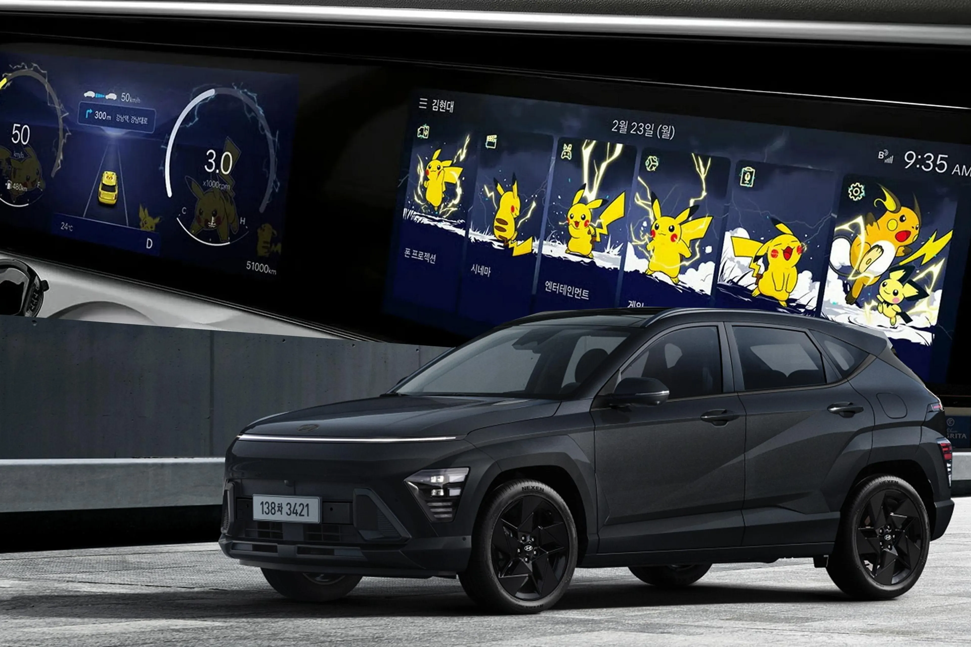
Hyundai adds Pokemon-themed displays for 2027 Kona update
Hyundai Kona being offered with lower SRP in Korea, and gets some interesting updates