
McLaren overhauls brand logo for its new corporate identity
McLaren overhauls brand logo for its new corporate identity
New wordmark takes inspiration from the New Zealand workshop where McLaren’s racing story began

The British supercar maker has unveiled a redesigned corporate identity.
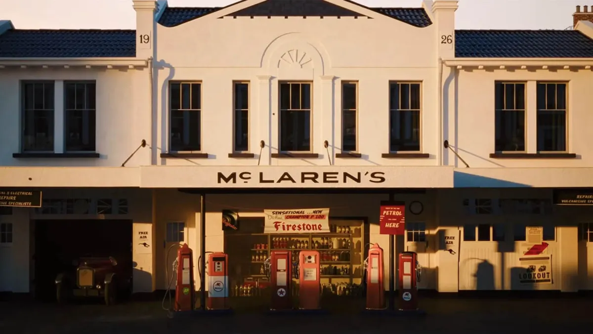
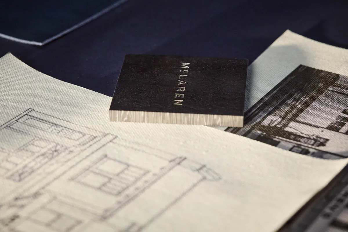
The newly designed wordmark takes inspiration from the signage of the family-owned service station in Auckland, New Zealand, where founder Bruce McLaren’s passion for engineering and motorsport first took shape.
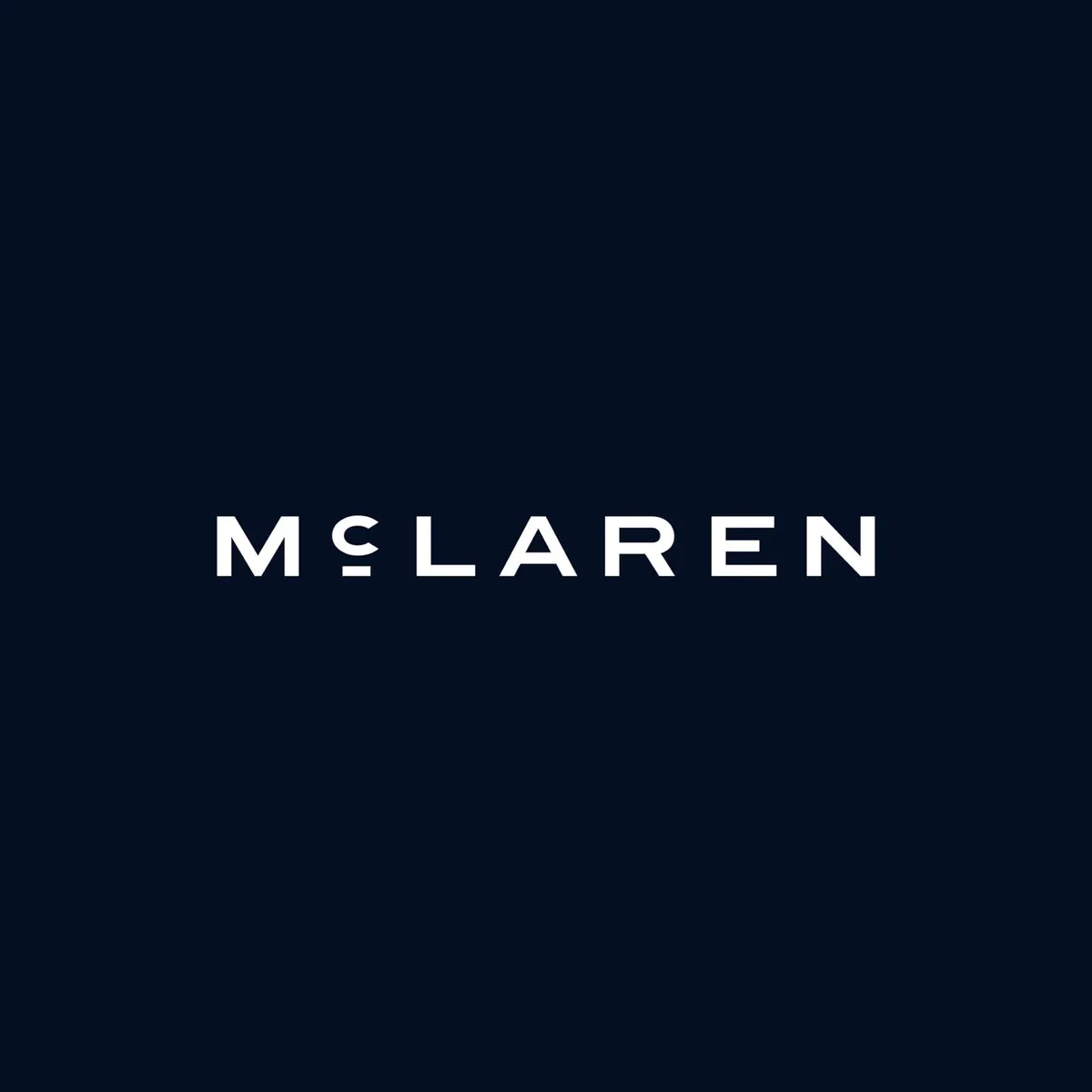
The new branding combines a streamlined wordmark with McLaren’s instantly recognizable Speedmark logo and will gradually appear across future production cars, merchandise and the brand’s digital platforms.
The connection to Bruce McLaren runs deeper than simply borrowing an old shop sign. At his parents’ service station, it was where Bruce modified a 1929 Austin Seven that eventually took him to his first race and his first motorsport victory at Muriwai Beach.
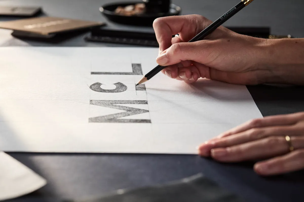
The new wordmark is an evolution of the original service-station signage, recreated using a custom typeface called McLaren Sans. It features all-uppercase lettering and a distinctive horizontal line beneath the “C,” giving the familiar McLaren name a cleaner, more contemporary appearance.
McLaren isn't abandoning its visual heritage, however. The iconic Speedmark remains, as does the Speedy Kiwi, which pays tribute to Bruce McLaren’s New Zealand roots.
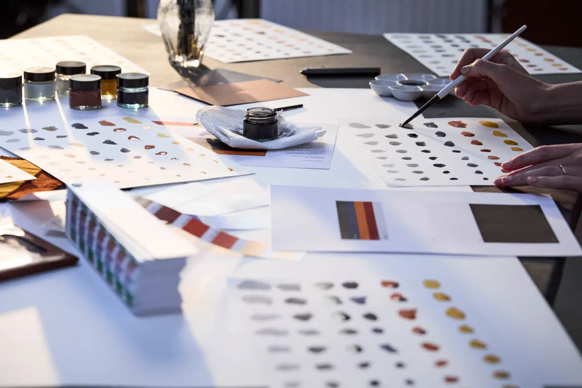
The refreshed color palette also draws directly from McLaren history. Alongside the brand's signature Papaya orange are Ember, Midnight, Black, Anthracite, Colnbrook silver and Mist white. McLaren says all seven colors were taken from a single historic photograph of Bruce McLaren sitting on the tire of his single-seater.
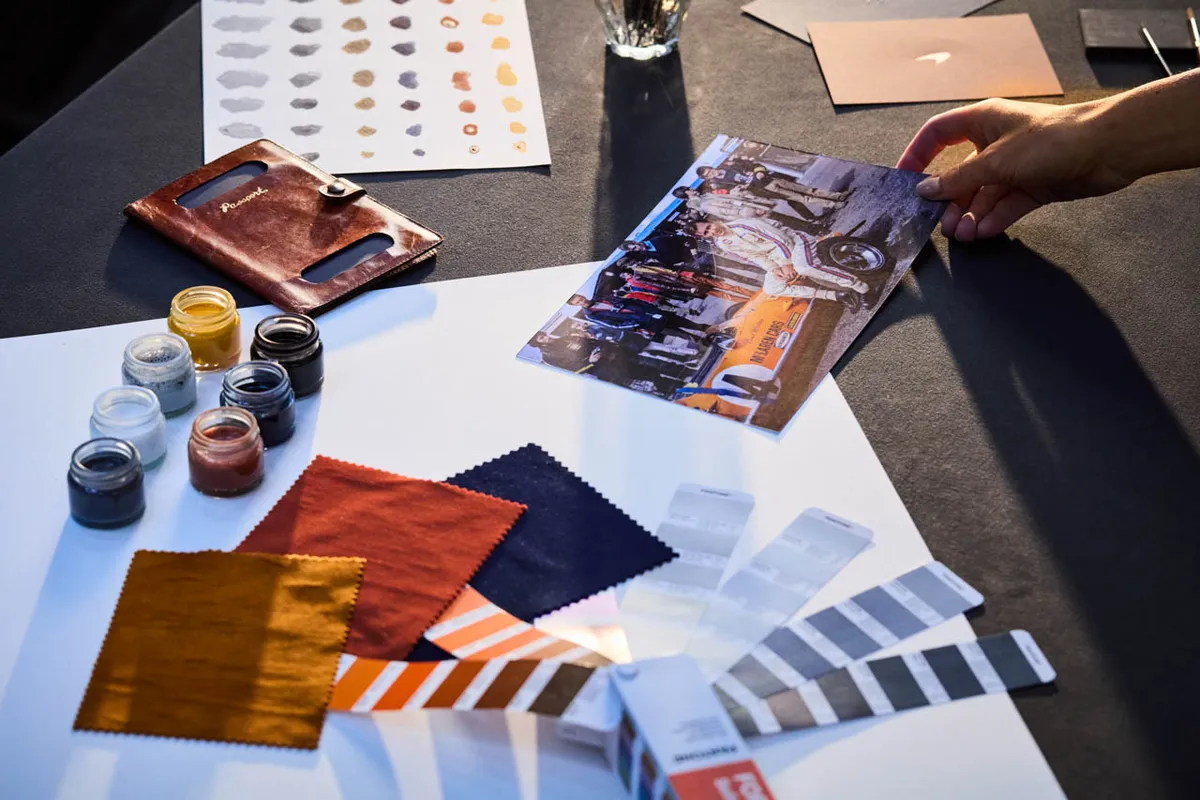
According to McLaren, the new identity is intended to connect its past, present and future across both McLaren Automotive and McLaren Racing, while creating a platform for what it describes as “deeper personalization, richer experiences and an even stronger sense of community” for owners and fans.
“There is something uniquely special about McLaren,” said David Woodhouse, McLaren Automotive’s Chief Creative Officer. “Throughout our history, we’ve never been content to follow established paths.”
Woodhouse added that the visual evolution represents “the beginning of a new chapter for McLaren,” reflecting the company’s ambitions for innovation and future growth.
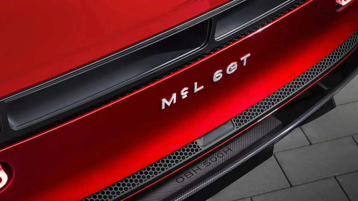
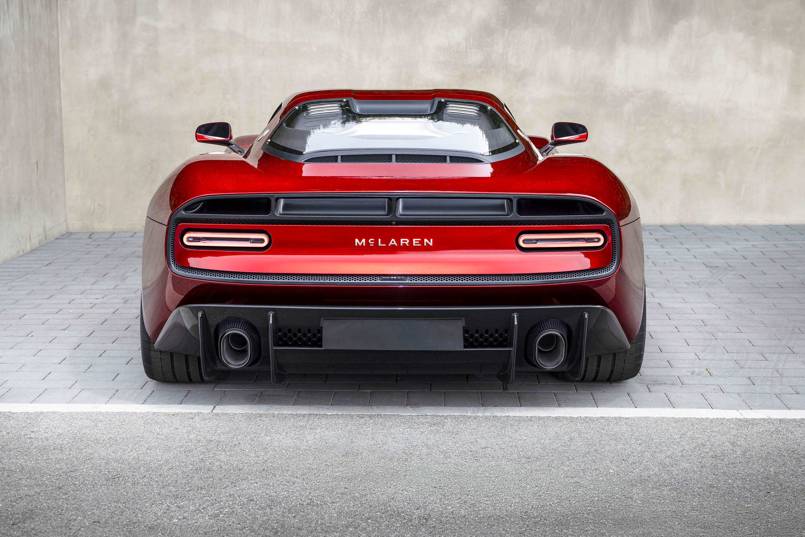
McLaren had already teased the new identity during last August’s Monterey Car Week with the unveiling of the McL 6GT.
The mid-engined supercar, featuring a manual transmission paired with a V8 engine, introduced a new design direction influenced by the legendary M6GT race car. It also featured the new McLaren typography between its taillights.
Now, with the official branding reveal, the “McL 6GT” lettering has been replaced by the full McLaren wordmark. The timing is significant as McLaren prepares for one of the biggest transformations in its history.
The company recently announced plans for a second UK manufacturing facility and a move toward in-house engine production as part of a £500 million (around $668 million) investment.
Its future product strategy will also move beyond the two-seat, mid-engined supercars that have defined McLaren for decades. The upcoming lineup is expected to include front-engined models with two rows of seating, including McLaren’s first-ever SUV.
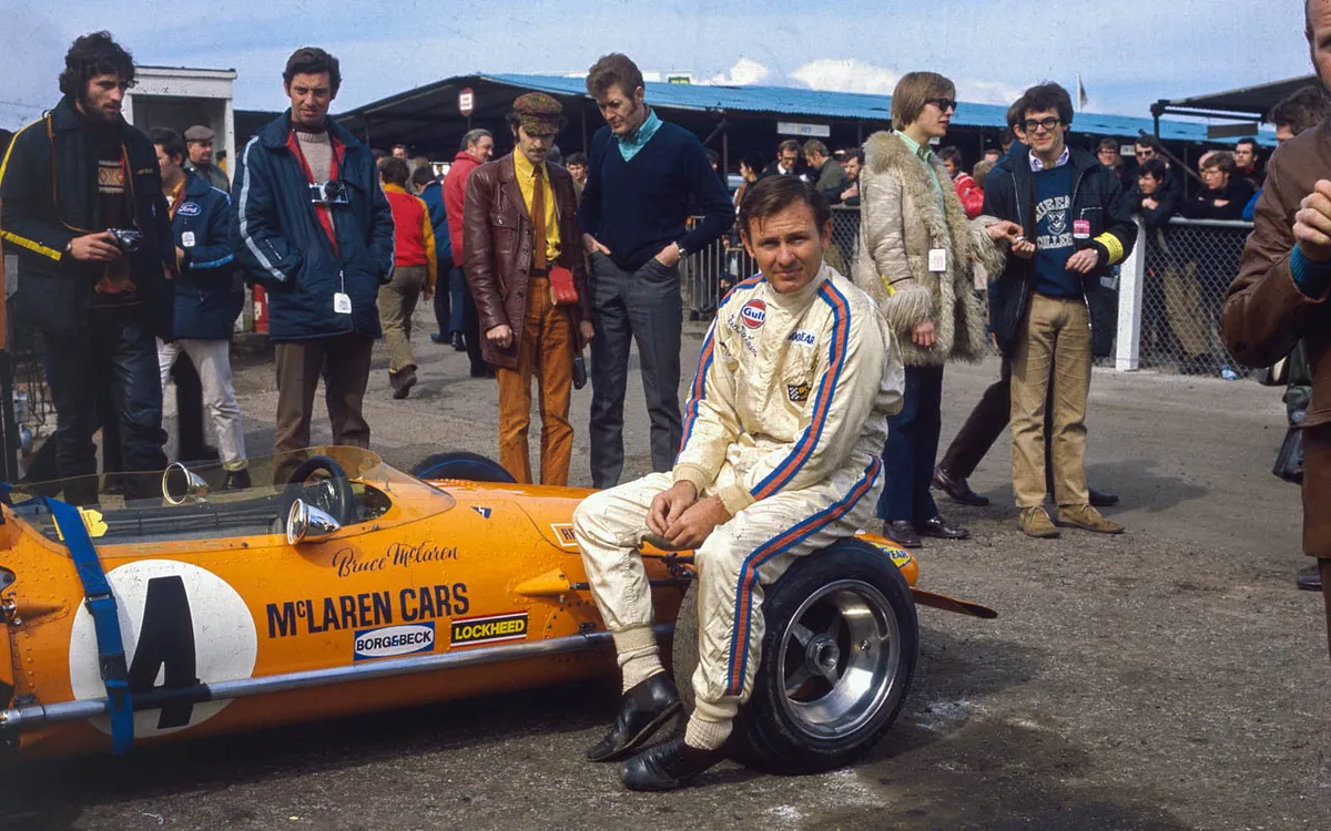
So while the logo may be getting a makeover, McLaren is going back to its roots for inspiration. And fittingly, those roots start with a young Bruce McLaren, an old Austin Seven and a small workshop in New Zealand.
Related Posts
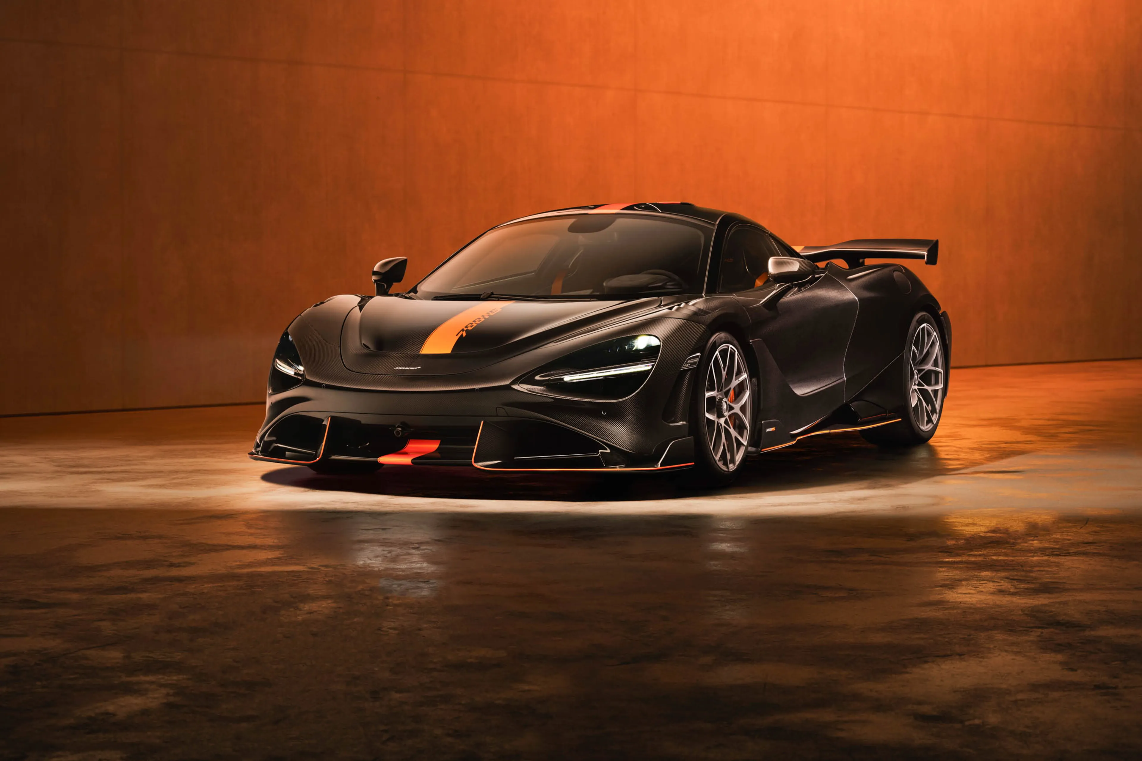
McLaren unveils 788HS as ultimate evolution of its Supercar Series
McLaren Automotive has introduced the new 788HS, a limited-production supercar that serves as the final and most extreme evolution of its acclaimed Supercar Series
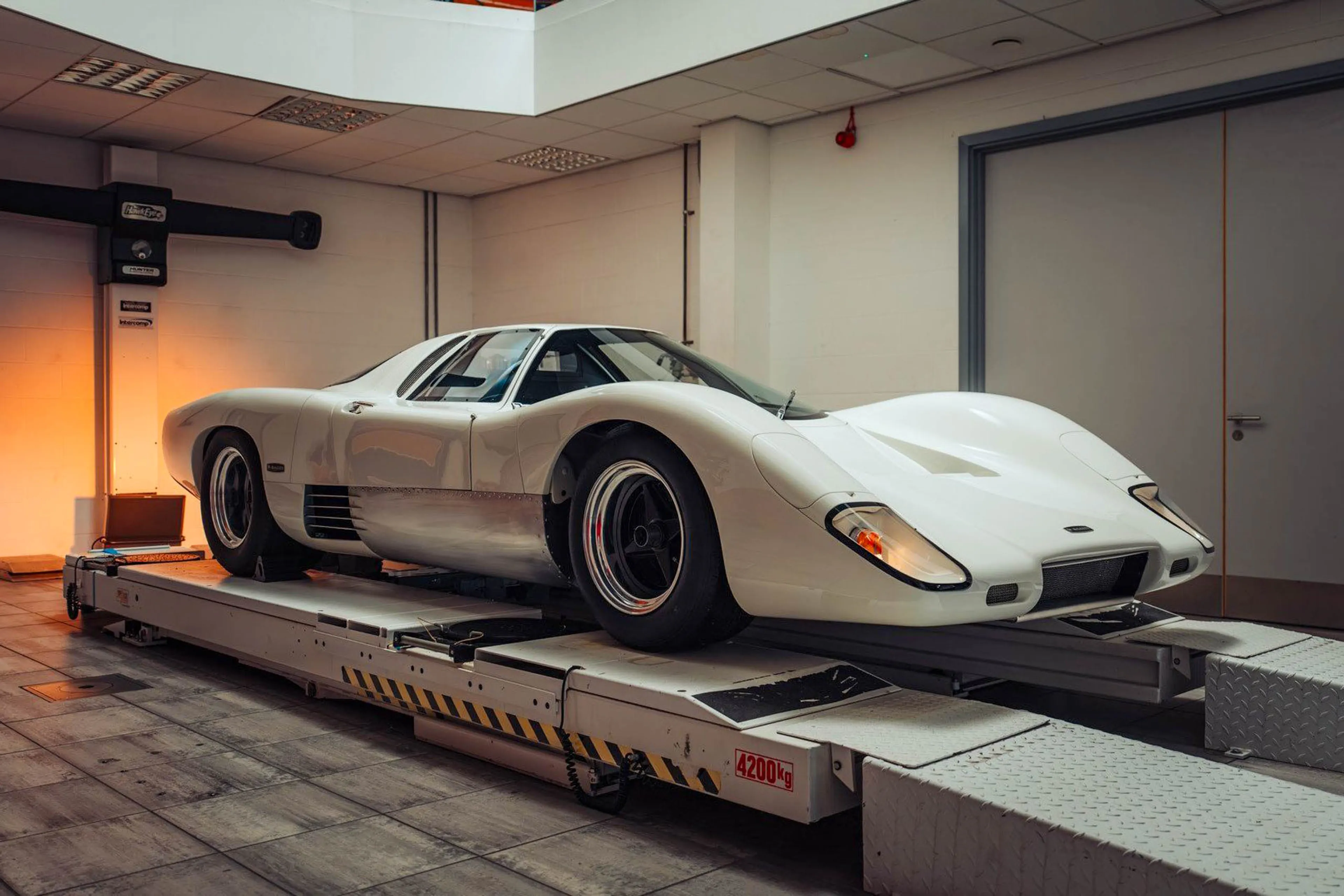
McLaren revives Bruce McLaren's original road-going supercar
Through its McLaren Special Operations (MSO) division, the British marque has completed an authentic reconstruction of the M6GT, which will make its public debut at the 2026 Goodwood Festival of Speed
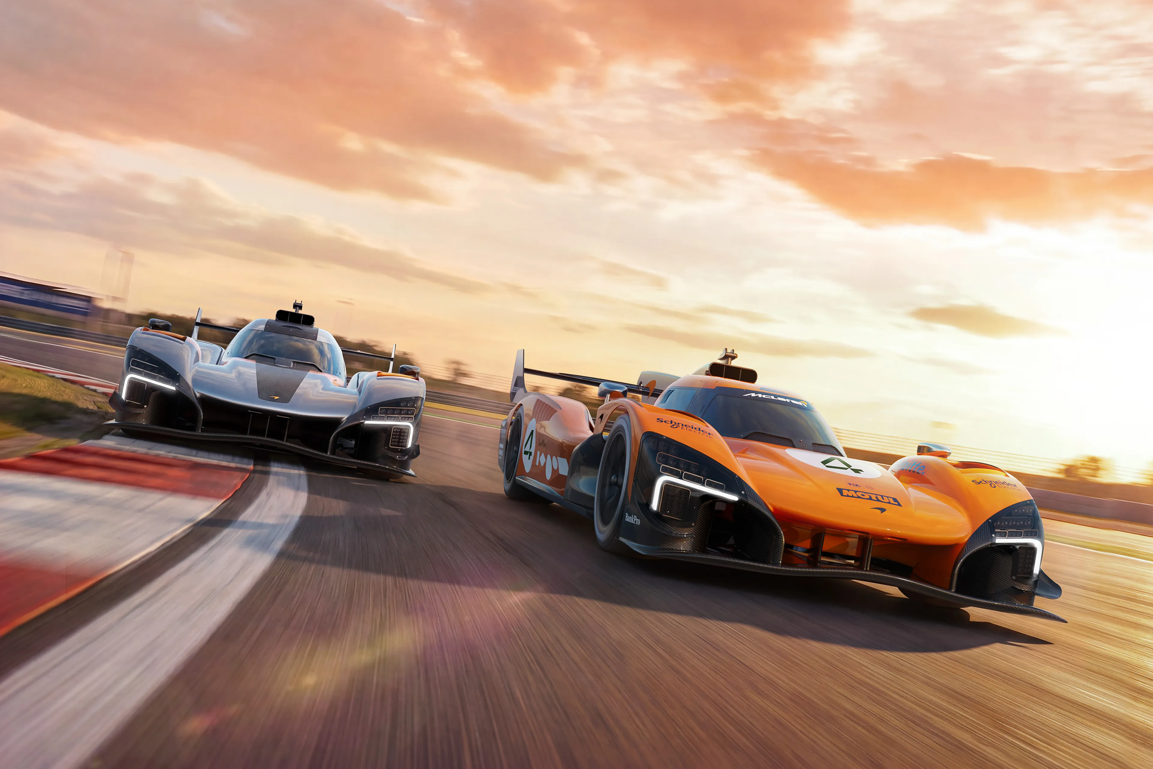
McLaren reveals new Le Mans racer called MCL-HY
McLaren MCL-HY will race in 2027 World Endurance Championship, including the 24 Hours of Le Mans
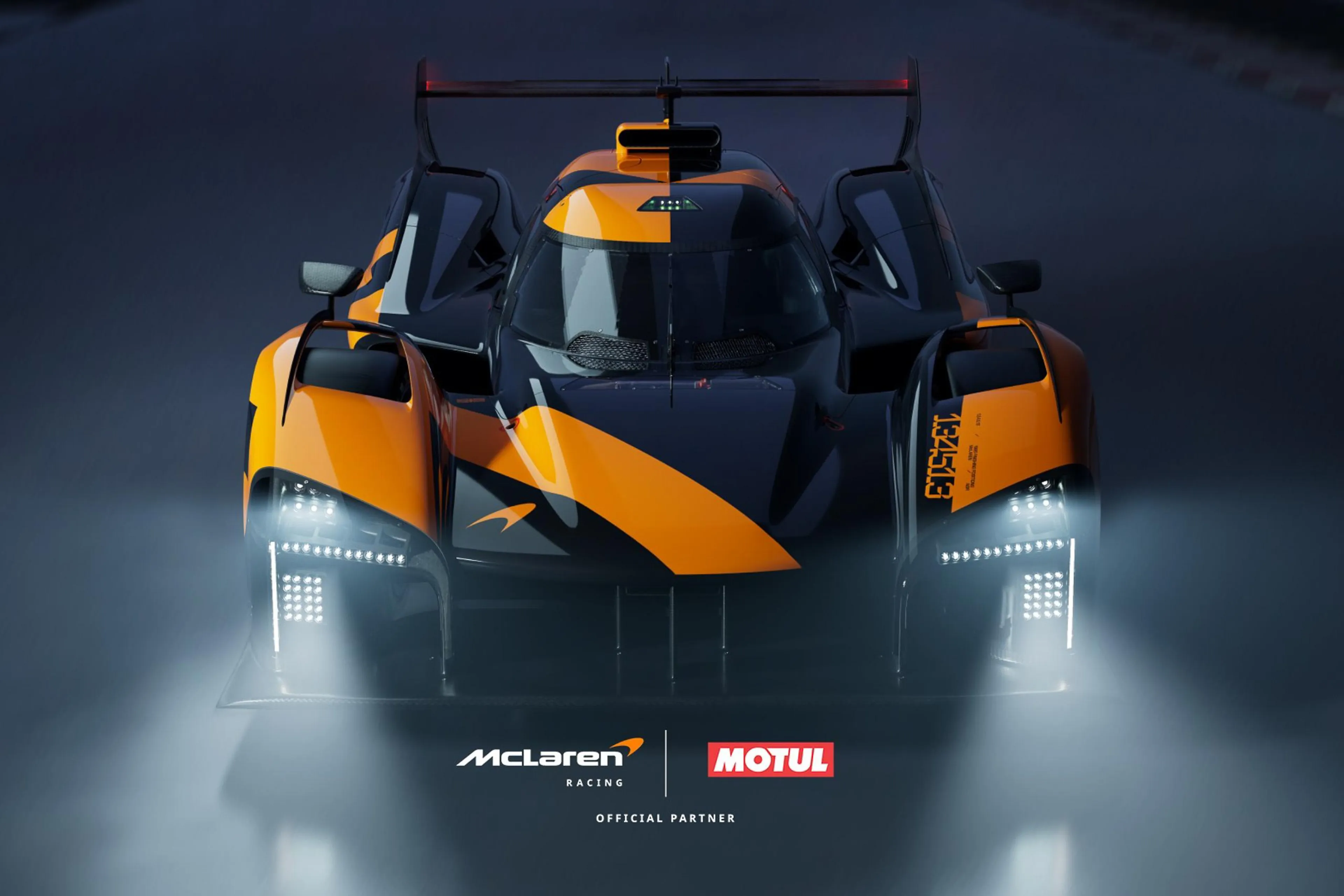
Motul to support McLaren Endurance Racing in FIA WEC 2027
Motul will provide advanced lubricants to McLaren United Autosports WEC Hypercar Team
Motul joins McLaren Formula 1 Team as an official supplier
Motul will provide the McLaren F1 Team with high-performance transmission lubricants
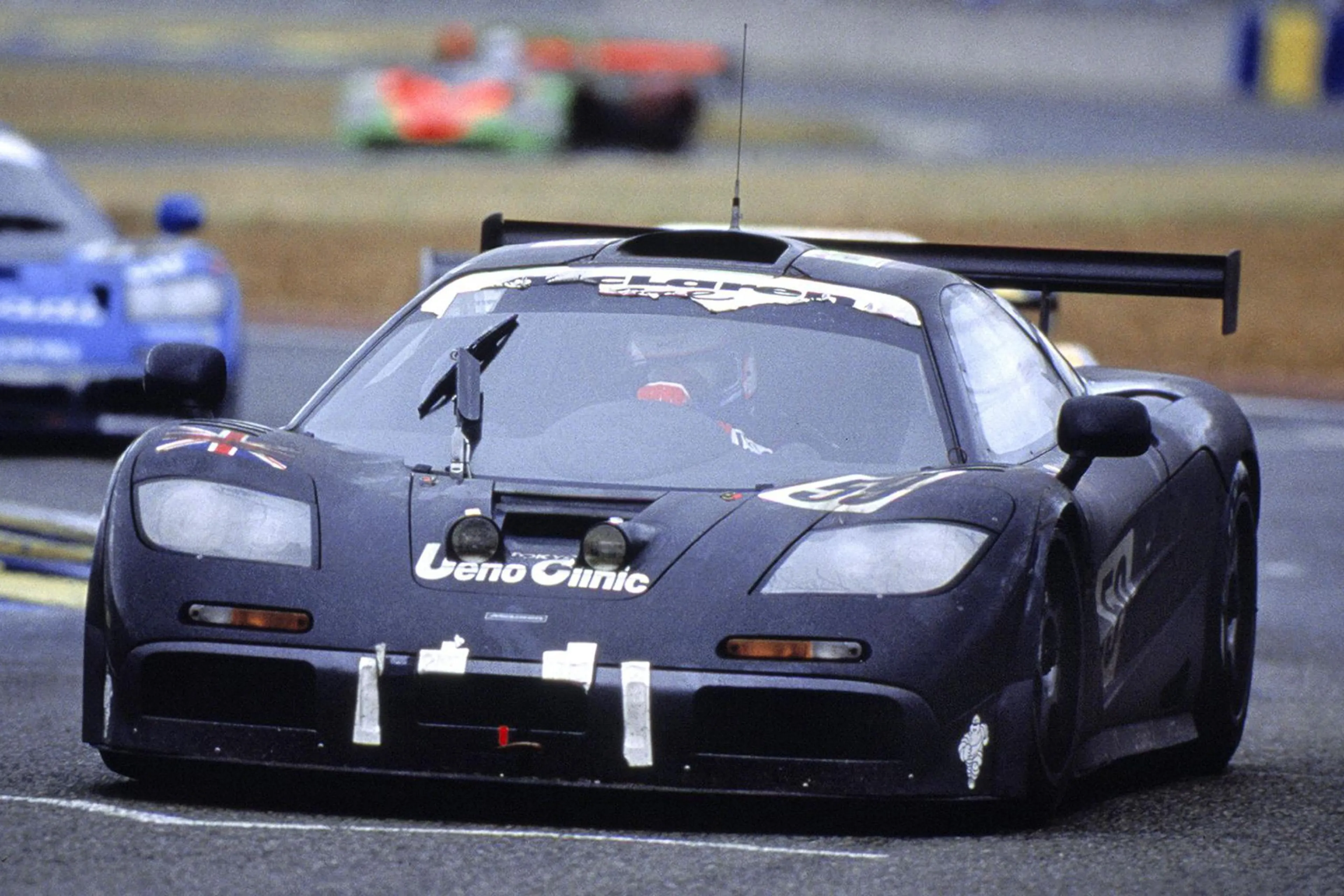
After Ford, McLaren next to join Le Mans hypercar party?
McLaren Racing CEO Zak Brown teases possibility of brand’s return to top-flight sportscar racing